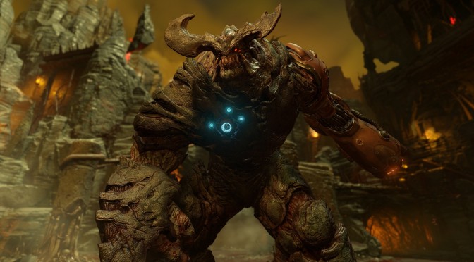
Yesterday, John shared a comparison between an image from the new Doom game and a photoshopped one that added more colours to it. Now while this comparison looked great and the shopped imaged looked better, this is something that won’t be easily achieved via a SweetFX mod.
You see, NATHAN RANNEY added specific colours via Photoshopped (instead of simply removing the game’s overused yellow filter). This can be easily noticed by the new blue-ish mouth of that monster (at this point, I’m not sure whether this is a Cacodemon or a Pain Elemental).
Thankfully, Imgur’s member ‘andritsu‘ has released a new comparison, showing what Doom looks like with and without the yellow filter.
Left images are without the yellow filter whereas right images are with the yellow filter.
Enjoy!
Thomas is a close friend to John ‘john2’ and John ‘WhatGoesAroundComesAround’. Thomas, John and John basically came with the idea of DSOGaming. Thomas has been helping John with News articles these past years, and prefers to stay in the background than the foreground.


