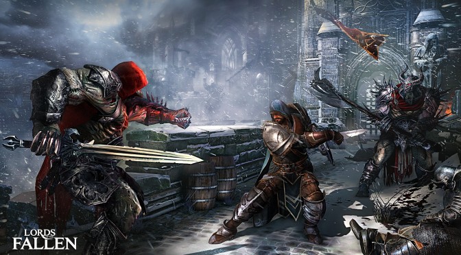
As you may already know, CI Games has not provided us with a review code for Lords of the Fallen. Even though we tried to get in touch with the publisher numerous times, we never heard back from it. We’ll talk more about this in our PC Performance Analysis (that will go live later this week). Until then, enjoy some comparison screenshots between the game’s Low and Very High settings. Quick note; Deck13 has used a Chromatic Aberation filter that makes the game look awful. As always, the “Very High” shots are on the left whereas the “Low” shots are on the right. Enjoy!

John is the founder and Editor in Chief at DSOGaming. He is a PC gaming fan and highly supports the modding and indie communities. Before creating DSOGaming, John worked on numerous gaming websites. While he is a die-hard PC gamer, his gaming roots can be found on consoles. John loved – and still does – the 16-bit consoles, and considers SNES to be one of the best consoles. Still, the PC platform won him over consoles. That was mainly due to 3DFX and its iconic dedicated 3D accelerator graphics card, Voodoo 2. John has also written a higher degree thesis on the “The Evolution of PC graphics cards.”
Contact: Email


