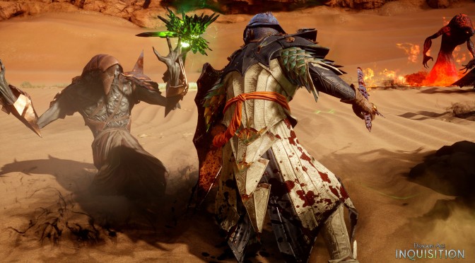
After trying – unsuccessfully – to secure a review code for Dragon Age: Inquisition for the past two weeks, we decided to simply go ahead and purchase this latest RPG title ourselves. We are a bit puzzled as to why EA refused to send us a review code, especially when a number of PC review codes were sent to various websites prior to the game’s release. Guess we are not good enough for EA.
Nevertheless, below you can find some comparison screenshots between the game’s Ultra and Low settings.
In order for all graphical settings to take effect, we had to restart our game (which explains some slight differences to the angles).
Ironically enough, the game’s post AA solution – while it does a great job at eliminating some jaggies – brings noticeable blurriness. In the last comparison – for instance – the floor looks crisper on Low settings.
What’s also really funny here is that there is almost 1GB of VRAM difference between these two presets. And to be honest, the actual visual difference does not justify this tremendous VRAM difference.
In short, and as we can clearly see, the biggest differences between these two presets are the complete lack of tessellation and ambient occlusion, as well as the lower shadow quality and the lower view distance.
As always, Ultra is on the left whereas Low is on the right. Make also sure to open the images in a new tab (in order to spot the differences easier).
Enjoy and stay tuned for our Performance Analysis!

John is the founder and Editor in Chief at DSOGaming. He is a PC gaming fan and highly supports the modding and indie communities. Before creating DSOGaming, John worked on numerous gaming websites. While he is a die-hard PC gamer, his gaming roots can be found on consoles. John loved – and still does – the 16-bit consoles, and considers SNES to be one of the best consoles. Still, the PC platform won him over consoles. That was mainly due to 3DFX and its iconic dedicated 3D accelerator graphics card, Voodoo 2. John has also written a higher degree thesis on the “The Evolution of PC graphics cards.”
Contact: Email


