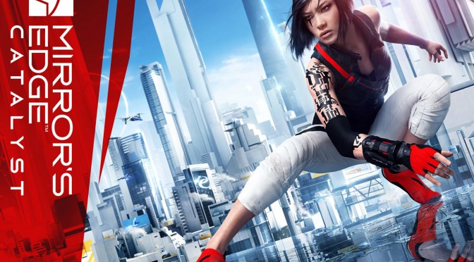
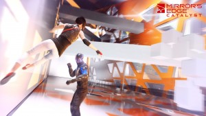
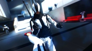
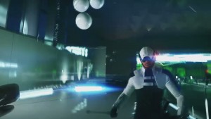
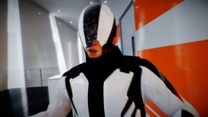
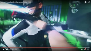
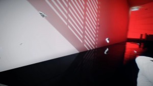
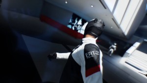
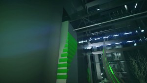
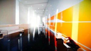
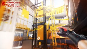
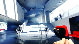
Mirror’s Edge: Catalyst is a really beautiful game that impressed everyone at this year’s E3. Powered by Frostbite 3, Mirror’s Edge: Catalyst looked gorgeous. But was DICE able to match the visuals of its prototype trailer that was showcased at 2013? Let’s take a look (for all images, 2013 is on the left whereas 2015 is on the right).
First of all, Faith’s model seems to be on par with what DICE showcased back in 2013. Although these images are from different angles, DICE came as close to the prototype as possible. We wouldn’t be surprised if there weren’t any differences at all to the model (polygon count wise).
On the other hand, the guard models that were featured in the 2013 trailer have been slightly changed. Not only that, but during the gameplay trailer we did not witness any damage being inflicted to their masks. Even though there is debris when Faith hits those guards, their masks seemed indestructible. Whether this is something that will change in the final version remains to be seen.
What DICE has added in the 2015 E3 build of Mirror’s Edge: Catalyst was tons of motion blur effects. The E3 prototype did not suffer from such a thing (there was a subtle one when Faith was sliding). Not only that, but DICE has also implemented anamorphic lens-flares (that were not present in the E3 2013 prototype). DICE has gone overboard with the anamorphic lens-flares during cut-scenes, though thankfully they have been toned down during actual gameplay.
DICE has also kept all the camera lighting bounce reflections that were used in its E3 2013 demo (pay attention on the left for the blue-ish effect from the lights).
Lighting seems to have taken a hit. That was to be expected as the lighting featured in the prototype 2013 demo seemed too advanced. Lighting bouncing has also been decreased, and the reflections in the 2015 build have definitely taken a hit. While the reflections in the 2013 prototype were top notch and high-resolution, those in the 2015 were not as good as them. Yes, we are comparing different surfaces here but it’s pretty obvious from the pictures featured here that the reflections are not as amazing as they were in the prototype build.
All in all, DICE came really close to its prototype 2013 video of Mirror’s Edge: Catalyst. Not only that, but – for better or worse – DICE has also added some new effects to it. The biggest and most obvious difference between the two builds is the more advanced lighting system that was used in the prototype.
Now here is hoping that the final product will look as good as its E3 2015 gameplay trailer.
Mirror’s Edge: Catalyst is currently planned for a February 2016 release.

John is the founder and Editor in Chief at DSOGaming. He is a PC gaming fan and highly supports the modding and indie communities. Before creating DSOGaming, John worked on numerous gaming websites. While he is a die-hard PC gamer, his gaming roots can be found on consoles. John loved – and still does – the 16-bit consoles, and considers SNES to be one of the best consoles. Still, the PC platform won him over consoles. That was mainly due to 3DFX and its iconic dedicated 3D accelerator graphics card, Voodoo 2. John has also written a higher degree thesis on the “The Evolution of PC graphics cards.”
Contact: Email

