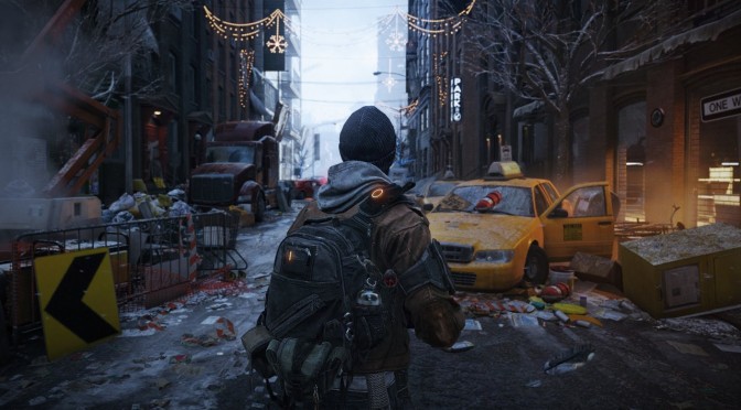
With the release of The Division’s latest official trailer, we decided to take a look and see whether it could match its early E3 gameplay trailers that were showcased back in 2013 and 2014. So below you can find some comparison screenshots between these builds, showcasing some of the changes that have been made to Ubisoft’s upcoming title.
First and foremost, let us say that this comparison is based on the E3 2013/2014 trailers and the latest one. In other words, we won’t compare their textures as those are affected by YouTube’s compression algorithms.
The biggest downgrade in The Division is undoubtedly its lighting system. As we can see in the following screenshots, the latest build feels flat in a lot of scenes. Not only that, but the earlier build featured more light sources (that casted proper dynamic shadows). For example, in the fifth comparison you can notice how the light bounces beautifully in the old E3 build.
And if that wasn’t enough, in the fourth comparison you can immediately notice the lack of even ambient occlusion in the game’s latest build (something that obviously won’t be an issues on the PC as PC gamers will most probably be able to force it).
Moreover, Ubisoft has used a color filter that degrades the overall image quality of the game (you can notice the ugly color filter in our last comparison). Whether there will be an option to remove it on the PC or not remains a mystery.
Furthermore, the earlier E3 build seemed to have more environmental objects on screen in pretty much all scenes, something that cannot be said about the latest build that was featured in the latest trailer.
In short, the game has been downgraded, there is no doubt about that. However, this does not mean that The Division looks ugly. Far from it.
We’ll have a better comparison once we get our hands on it (so we can also put the game’s destruction system to the test), so stay tuned for more.
Old E3 build is on the left, whereas the latest build is on the right.

John is the founder and Editor in Chief at DSOGaming. He is a PC gaming fan and highly supports the modding and indie communities. Before creating DSOGaming, John worked on numerous gaming websites. While he is a die-hard PC gamer, his gaming roots can be found on consoles. John loved – and still does – the 16-bit consoles, and considers SNES to be one of the best consoles. Still, the PC platform won him over consoles. That was mainly due to 3DFX and its iconic dedicated 3D accelerator graphics card, Voodoo 2. John has also written a higher degree thesis on the “The Evolution of PC graphics cards.”
Contact: Email

