E3 is the biggest gaming event and we’ve seen in the past developers faking their games. Games like Motorstorm and Killzone 2 are two grand examples of games presenting CG trailers as videos featuring in-game footage. Not only that, but numerous games get exclusive builds for E3 that look better than their final builds, pushing the lighting or other features to the next level. The Witcher 3, Watch_Dogs and The Division are examples of such a thing. However, there are also games that look just as good as their E3 demonstrations, and there are fewer occasions where games can look better than their E3 demos.
The best-known examples of games looking as good as their E3 demos are DICE’s titles. DICE’s Battlefield and Battlefront games look incredible and on par with what the team has showcased during its E3 presentations. Ubisoft’s For Honor is also another title that looked similar to its E3 presentation, as was Mirror’s Edge Catalyst.
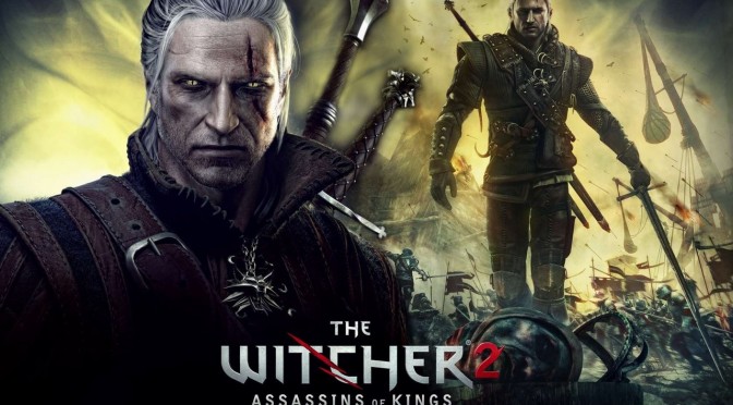
But what about games that looked better than their E3 demos? Well, it appears that one of them is The Witcher 2: Assassins of Kings. YouTube’s ‘Cycu1’ a comparison video between the E3 2010 and the final version, and the results speak for themselves.
Right from the beginning, the lighting seems better and more advanced in the final/retail version of The Witcher 2. Geralt’s character model has also been improved. CD Projekt RED has used a different model and apart from the aesthetic differences, the retail model packs more polygons and better textures.
The terrain also looks more detailed with better textures, and the geometry (especially the rocks) seems improved. The aggressive DoF bokeh effect of the E3 demo has been slightly reduced, resulting in better – overall – visuals. Grass, weapons and most of the other characters (especially the Elves accompanying Iorveth) look the same.
Below you can view the comparison video. Enjoy!

John is the founder and Editor in Chief at DSOGaming. He is a PC gaming fan and highly supports the modding and indie communities. Before creating DSOGaming, John worked on numerous gaming websites. While he is a die-hard PC gamer, his gaming roots can be found on consoles. John loved – and still does – the 16-bit consoles, and considers SNES to be one of the best consoles. Still, the PC platform won him over consoles. That was mainly due to 3DFX and its iconic dedicated 3D accelerator graphics card, Voodoo 2. John has also written a higher degree thesis on the “The Evolution of PC graphics cards.”
Contact: Email

