As you may have already noticed, there are some slight changes to our layout. As I hinted a week ago, we’ll be updating DSOG’s layout. That’s fine – you may think – but there is a catch; you will be the ones who will determine the look of the new DSOG. We’ll present you three layout from which you can choose from.
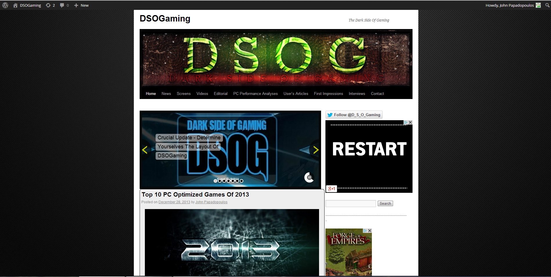
The first layout is our old, default one. If you prefer that one, you can vote for it (via the comment system or via our FB page) by typing number “1”.
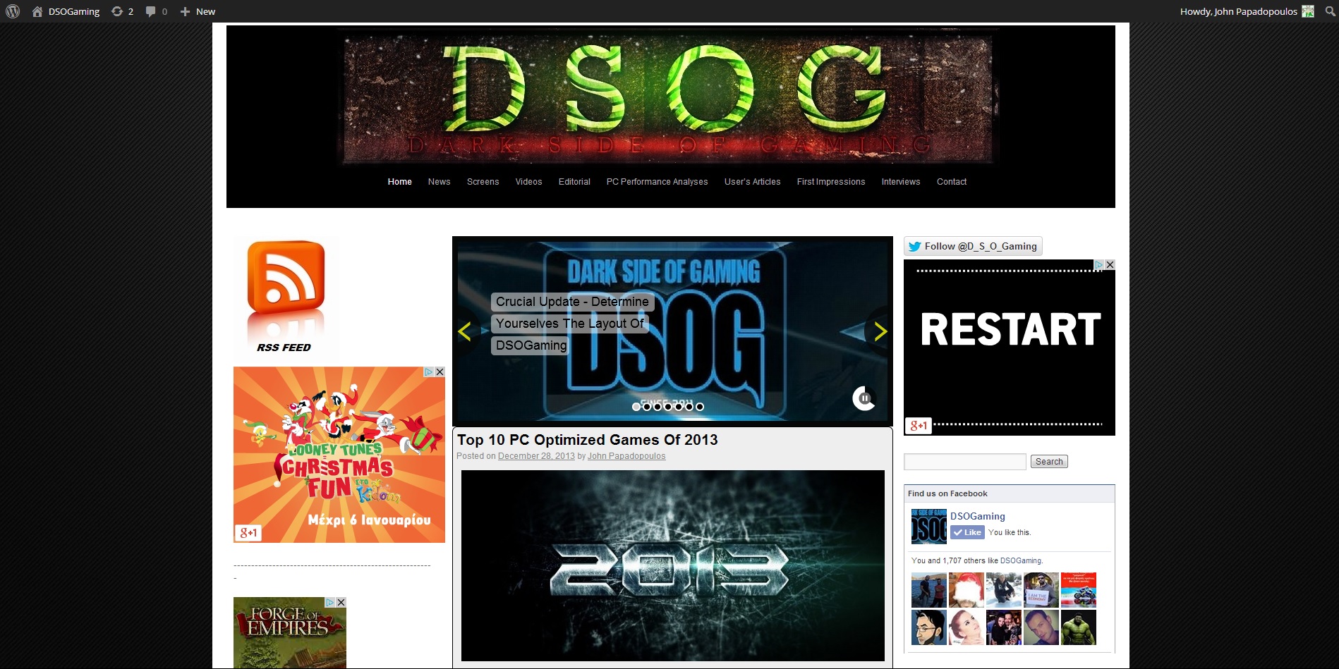
The second layout is this expanded version. This version has various tweaks we believe are great. For instance, the content area is bigger. There are now three columns, and our website is both ‘bigger’ and more ‘compact’. If you prefer this one, you can vote for it by typing number “2”.
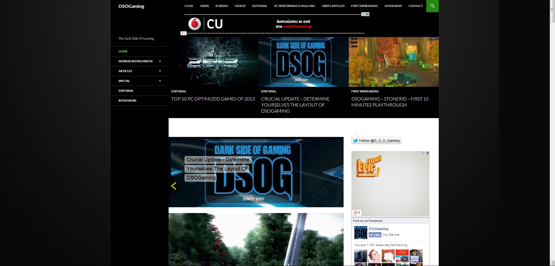
The third layout is a completely new one which will go live this Sunday. Naturally, you can vote for it by typing number “3”.
In order to give you more time with each of these layouts, we’ll keep this expanded version of our previous layout until Sunday. On Sunday, we’ll roll out the third layout and we’ll keep it until January 2nd.
We believe that it is best to let you – our readers – choose the layout you find more interesting. As we’ve already said, we’re doing things differently here in DSOG as we are independent. We always hated when other websites altered their looks without asking us whether their new look is better or worse. And this is precisely why we are not doing such a thing in DSOG.
Merry Christmas and feel free to let us know your thoughts about the layouts, and the one you feel is best.
[UPDATE]
Our third layout is now live. Feel free now to vote for your favourite one. Below you can find some comparison shots between our three themes:
THEME 1
THEME 2
THEME 3

John is the founder and Editor in Chief at DSOGaming. He is a PC gaming fan and highly supports the modding and indie communities. Before creating DSOGaming, John worked on numerous gaming websites. While he is a die-hard PC gamer, his gaming roots can be found on consoles. John loved – and still does – the 16-bit consoles, and considers SNES to be one of the best consoles. Still, the PC platform won him over consoles. That was mainly due to 3DFX and its iconic dedicated 3D accelerator graphics card, Voodoo 2. John has also written a higher degree thesis on the “The Evolution of PC graphics cards.”
Contact: Email


