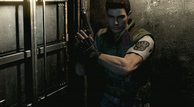
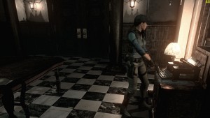
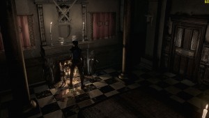
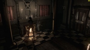
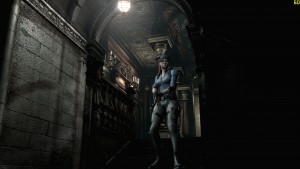
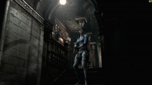
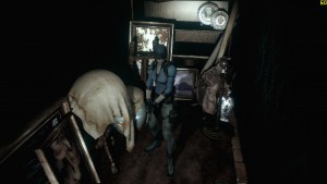
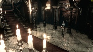
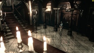
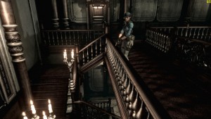
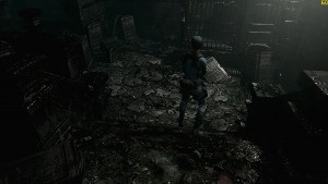
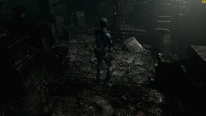
Resident Evil HD Remaster releases tomorrow, and Capcom was kind enough to provide us with a review code for this remake of its classic horror RE title. Below you can view our comparison screenshots between the game’s Low and High settings. Stay tuned for our First Impressions – that will be accompanied by a 10 Minutes Playthrough.
Low details are on the left whereas High details are on the right. Given the game’s pre-rendered backgrounds (which basically means that those backgrounds look the same in both Low and High settings), it’s really hard spotting the differences.
Those with a keen eye will notice a difference at the quality of Jill’s textures and shadows (grass and door textures are also affected by the in-game settings), however there is not that of a huge difference. The biggest gripe here is that the backgrounds still look blurry (especially for a game advertised as HD), and there is nothing to do about it (unless of course experimenting with SweetFX).
Enjoy!

John is the founder and Editor in Chief at DSOGaming. He is a PC gaming fan and highly supports the modding and indie communities. Before creating DSOGaming, John worked on numerous gaming websites. While he is a die-hard PC gamer, his gaming roots can be found on consoles. John loved – and still does – the 16-bit consoles, and considers SNES to be one of the best consoles. Still, the PC platform won him over consoles. That was mainly due to 3DFX and its iconic dedicated 3D accelerator graphics card, Voodoo 2. John has also written a higher degree thesis on the “The Evolution of PC graphics cards.”
Contact: Email

