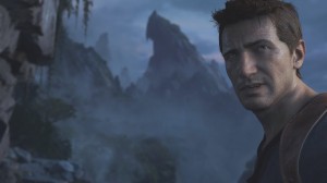
Sony has released a new gameplay trailer for Uncharted 4: A Thief’s End. Back in E3, Naughty Dog claimed that its trailer ran on a PS4 in real-time at 1080p/60FPS. Therefore, we believe it’s really interesting to compare that reveal trailer with the latest in-game footage, as well as the game’s character models with those of Crysis 3, Ryse, COD: Advanced Warfare and Assassin’s Creed: Unity.
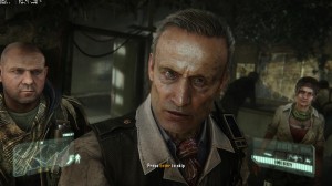
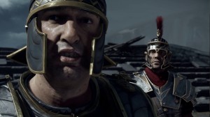
Do note that in the last segment we are comparing the cut-scene models from those games. In the case of Ryse, Assassin’s Creed: Unity and Uncharted 4: A Thief’s End, the cut-scene models appear to be of a higher quality than those found while actually playing the game.
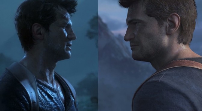
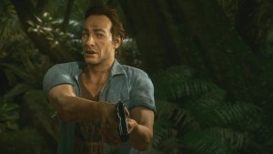
For starters, let’s compare the E3 model with the Playstation Experience model. Now this is the only comparison in which we’ll comment. For this comparison we used NeoGAF’s member ‘arevin01’ image. The biggest difference here is the hair. Let’s exclude for a second the different TOD and let’s look at the hair. As we can clearly see, the PS Experience model has less detailed hair (pay attention also to the edges).
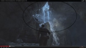
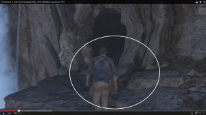
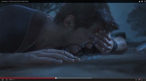
As we claimed, Uncharted 4: A Thief’s End cut-scenes visuals seem of a higher quality than the actual in-game ones. A big difference between the E3 reveal trailer and the latest in-game footage, for example, is the complete absence of light shafts. Even in this scene – in which we should be getting some shafts from that hole – there aren’t any. In contrast, the E3 reveal trailer featured some lovely shafts caused by the moonlight. Even when Drake is fighting in daytime, there are no light shafts whatsoever.
Moving on to shadows. In the E3 reveal trailer, Drake’s model was casting some beautiful highly detailed self-shadows. Unfortunately, the latest gameplay trailer lacked them. While there are some ambient occlusion effects, it seems that a lot of light sources do not cast shadows. Furthermore, the lighting system itself seems simpler than the one used in the E3 reveal trailer. The shadowing system also feels simpler, as all self-shadows are “pixel-y” due to their lower quality nature.
As we can see here, there is an actual light source behind Drake and as a result of that, we get a nice shadow on the ground. However, notice the complete lack of self-shadows and how bland, empty and flat Drake himself looks. We may all agree that there are different TODs in this comparison, however there is no doubt that the whole lighting and shadowing system seems ‘downgraded’ (and that has nothing to do with TODs).
Last but not least, the E3 reveal trailer packed some realistic water drops that are missing from the latest in-game footage. Instead of those highly detailed water drops, we get some simple water splashes.
All in all, it’s obvious that the in-game footage is not up to what Naughty Dog showcased in the game’s E3 reveal trailer. Oh, and for what is worth, Uncharted 4 is undoubtedly the most impressive – visually – console game we’ve seen to date. This comparison does not mean that it looks awful. On the contrary.
And now, here are the comparison shots between Uncharted 4 and Ryse, Crysis 3, Call of Duty: Advanced Warfare and Assassin’s Creed: Unity.

John is the founder and Editor in Chief at DSOGaming. He is a PC gaming fan and highly supports the modding and indie communities. Before creating DSOGaming, John worked on numerous gaming websites. While he is a die-hard PC gamer, his gaming roots can be found on consoles. John loved – and still does – the 16-bit consoles, and considers SNES to be one of the best consoles. Still, the PC platform won him over consoles. That was mainly due to 3DFX and its iconic dedicated 3D accelerator graphics card, Voodoo 2. John has also written a higher degree thesis on the “The Evolution of PC graphics cards.”
Contact: Email

